This was the last assignment of Multimedia class. It required that I create a 3D showroom to showcase myself. It took me several tries to get the lights working, and the room itself didn't really conform to the guide. The lights were the hardest to me, because sometimes the elliptical tool did not want to work, and I had to be careful of the opacity and position of the spotlights. I had a classmate take three photos of me, the front, side, and back views, and I arranged them under the spotlights. I also erased the backgrounds and had to use the smudge tool to smooth out some eraser bumps.
Wednesday, June 5, 2013
Tuesday, May 28, 2013
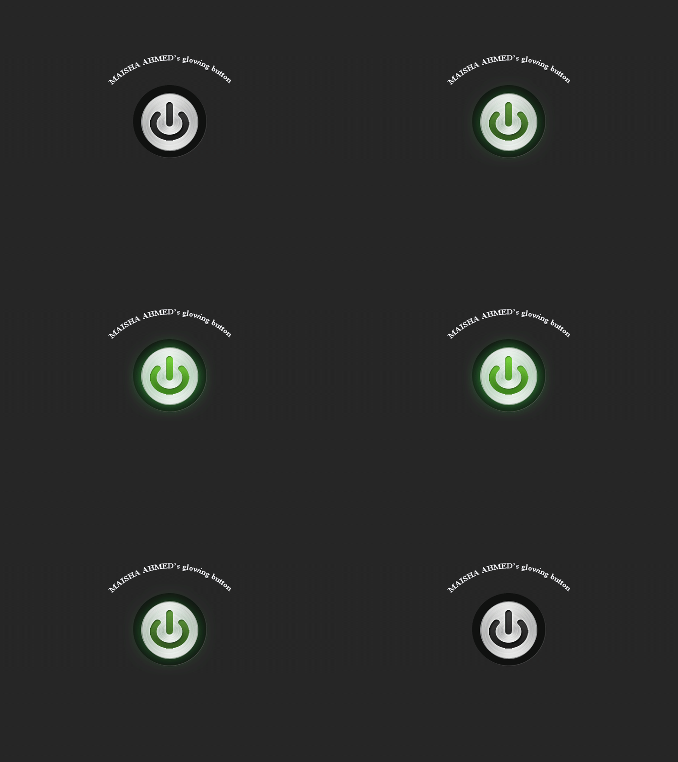
Power Button Animation
For this assignment, I had to create an image of a power button. I used different filters and blending options to create the glowing button and the aluminum effect to give the button a more realistic look. After adding the power button image, I then created the "green glow" of the button on a duplicate copy. After both buttons were saved, I created the animation where the button is continuously turning on and off. This assignment was difficult, and I had to try several times to get the power button image right. I recommend asking someone who is already a master of Photoshop for guidance if you're stuck.
Link: http://www.photoshop-plus.co.uk/2011/10/05/learn-how-to-create-a-simple-glowing-animation/
Link: http://www.photoshop-plus.co.uk/2011/10/05/learn-how-to-create-a-simple-glowing-animation/
Monday, May 20, 2013
3D Effect Bungalow
In this assignment, I created a 3D effect on my bungalow by using three layers, one being the grassy background, another one being the bungalow, and the last a copy of the bungalow layer. The original bungalow layer retains the 'G' and 'B' on the blending options, but the copy retains the 'R' blending option. After using the 'Magic Wand' tool to remove the background of the bungalow, we can see the bungalow on the grassy field. After moving the copy slightly to the right, the 3D image has been created. Now all that is needed are a pair of 3D glasses!
Friday, May 17, 2013
Bungalow
Tuesday, May 14, 2013
Block Quiz
This was actually a quiz to see if we could use what we learned to create a block with a rounded shape. It was extremely frustrating to do this block because it required circles and the meticulous use of the 'delete' button.
Thursday, May 9, 2013
Assignment 21: 12 3D Blocks
Friday, April 26, 2013
20 A, B, C: 2D Shapes, 3D Shapes, My Name
For this assignment, I used Google Sketch for the first time. The objective was to play around with the many buttons and programs on Google Sketch to create 2D shapes and 3D shapes on a 2D axis. Also, I had to write out my name and make it 3D. The process was frustrating and a little time consuming, considering that the line tool doesn't do what I want it to.
Wednesday, April 24, 2013
Realistic Pendrive
This assignment was to create a realistic thumbnail/flash drive out of rectangles and ellipses by using Adobe Illustrator. I had to set the gradients to very specific numbers or else the end product would look very off. Using the Line Tool is very difficult for a first timer, and I guess I'll have to practice using that tool as well.
Link: http://www.tutorialboard.net/create-realistic-pendriveas-adobe-illustrator/
Link: http://www.tutorialboard.net/create-realistic-pendriveas-adobe-illustrator/
Monday, April 15, 2013
Soft Blur
Friday, April 12, 2013
Quick Mask
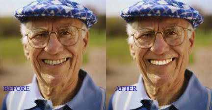
This assignment is to use masking techniques to make detailed changes to photos. I now know how photo editors whiten teeth on models.
Link: http://www.tutorialboard.net/using-a-quick-mask-to-make-a-detailed-selection/
Link: http://www.tutorialboard.net/using-a-quick-mask-to-make-a-detailed-selection/
MCSM Brochure
This assignment is to create a brochure about Manhattan Center For Science and Math (MCSM). More specifically, about my daily schedule. This was done on Microsoft Publisher and I learned to save all publications on a PDF file.
Thursday, April 4, 2013
Smart Filters
GO GO GO!!!!! From tutorial board, a project utilizing "smart filters" to create an illusion of a moving object. After choosing a sports car called a "Lamborghini" in an attractive shade of orange, I opened it on Photoshop as a "Smart Object." After selecting a blur option and brush option, the filter allows you to "erase" the blurs on the car but keep the background, making it seem like the car is moving. This project took me 15 minutes at the most. It's only 17 steps long and doesn't require this option or that filter or this image and that mode.
Link: http://www.tutorialboard.net/understanding-and-using-smart-filters-in-photoshop-for-dynamic-adjustments/
Wednesday, April 3, 2013
Fashion Show Flyer
It's that time of year again. The time where before a long spring break, the fashionable and artistic students of MCSM will put on a fashion show to show off clothing that falls into a category of style. This event will no doubt inspire a slew of assignments from teachers to commemorate it. Why not a student-made flyer? The date and location has been provided, and yes, I discovered how fun it was to play around with text effects and shadowing.
Flag Displacement
This assignment calls for a national flag and a...brick wall? The idea of this project is to create a spray-paint effect that would look like a flag has been painted on a brick wall, basically graffiti art. The idea is to use layers and effects to "magically" warp the flag onto a brick wall. The "distortion" button and the opacity percentage is what really made the graffiti. Perhaps I should write a poem dedicated to the wonders of layers and opacity in Photoshop.
Link: http://www.tutorialboard.net/create-a-painted-effect-look-with-displacement-maps-in-photoshop-cs4/
Face Displacement
I love America and I love Abby from NCIS. And because Abby loves America too, I decided to highlight the U.S. flag on her face! This assignment required a lot of patience and experience with Photoshop for me. Unfortunately, I originally had the flag highlighted all over Abby, not just her face. But because the assignment called for her face to be highlighted, the eraser tool became my enemy when I had to erase the flag from everywhere except her face. The end result is nothing special too me, but it got the job done...so meh.
Link: http://www.tutorialboard.net/create-a-painted-effect-look-with-displacement-maps-in-photoshop-cs4/
Change One Thing Poster
 |
Instead of routinely drinking a can of orange soda a day, switch it up with a fresh glass of iced green tea! The purple and white background was made by using the gradient tool. After 10 minutes of copying, pasting, and re-sizing soda cans, I finally finished, replaced one can with the green iced tea, and then I did the banner at the bottom to finish it off.
Texture Effect
These special effects on Photoshop still baffle me. But I had fun choosing which texture at which opacity would look good on the dress. Needless to say, I think the end result is sheer genius.
Link: http://www.tutorialboard.net/texture-layer-modes/
Monday, March 11, 2013
First Marking Period Powerpoint
Subscribe to:
Comments (Atom)


